Acrylic surface finishes · A practical guide
Shine, visibility, and glow are different effects.
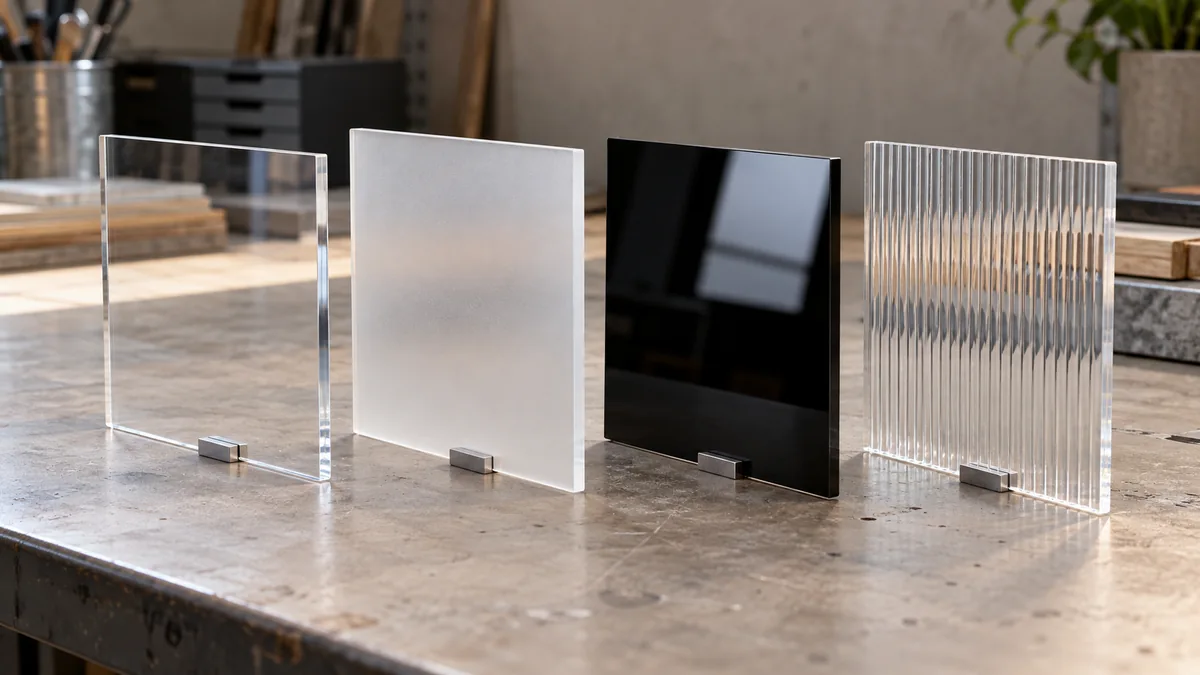
Glossy acrylic has a smooth, shiny appearance. Matte acrylic softens surface reflections. Frosted acrylic gives an etched-glass effect and usually softens the view through the sheet. Textured acrylic adds a surface pattern, while non-glare acrylic makes reflections less distracting over artwork or graphics.
These acrylic sheet finishes overlap: a frosted sheet can also be matte, and a non-glare sheet can have a fine texture. To compare them, separate how the face reflects light, how clearly you can see through it, and how it spreads light from behind.
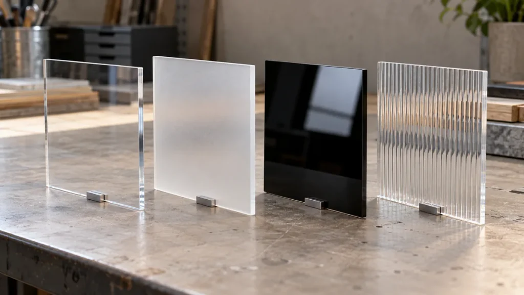
Acrylic Sheet Finishes at a Glance
| Finish | Main visual effect | Useful starting point | What to check |
|---|---|---|---|
| Glossy | Smooth face with distinct reflections | Clear covers, colored panels, polished displays | Whether reflected lights compete with the view |
| Matte / satin | Softer, less distinct reflections | Background panels, furniture details, low-shine surfaces | Clarity and scratch resistance separately |
| Frosted | Etched-glass appearance; softened visibility | Privacy dividers, decorative inserts, translucent features | What remains visible at the intended distance |
| Textured | Visible or tactile pattern | Ribbed panels, decorative screens, patterned interiors | Pattern direction and surface relief |
| Non-glare | Less distracting reflections over an image | Picture framing and graphic covers | Fine-detail visibility and the gap behind the sheet |
Swipe the table sideways to compare all four columns.
Finish names describe common effects. They do not establish a fixed level of clarity, privacy, or durability for every sheet.
Glossy vs Matte Acrylic: What Changes?
The main difference between glossy and matte acrylic is the appearance of reflected light. A smooth glossy face produces a more distinct reflection. A matte surface spreads reflected light in different directions, making a lamp or window less sharply defined. This relationship between surface texture and gloss is explained in BYK-Gardner’s gloss measurement guide.[1]
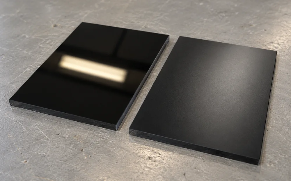
Glossy finishes suit designs that call for a polished surface. Matte acrylic, also spelled matt acrylic, provides a quieter background. Satin acrylic usually describes a softer sheen, although satin, matte, and frosted labels can overlap between suppliers.
Surface shine and transparency are separate choices. Glossy acrylic can be clear, translucent, or opaque. A black sheet can have a glossy face without becoming see-through; a matte sheet likewise needs a separate check for viewing clarity.

From Grandview Acrylic
The pictured glossy black face illustrates why shine and opacity are different properties. Explore our glossy and matte black sheet options.
Matte vs Frosted Acrylic: Are They the Same?
The terms often overlap, but they emphasize different effects. Matte describes low surface shine; frosted describes an etched-glass appearance, often with softened visibility through the sheet.
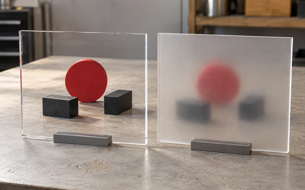
Frosted acrylic, also searched for as frosted plexiglass, lets light through while scattering it. A panel can look bright while obscuring fine detail behind it. Light transmission and a clear view are different properties: ASTM D1003 treats luminous transmittance and haze as separate measurements for transparent plastics.[2]
That difference matters for a divider. “Light passes through” does not mean “people cannot see through.” Faces, silhouettes, and nearby objects may remain visible depending on texture, color, lighting, and distance. Check the intended setup, and see our clear vs frosted acrylic guide for a closer comparison of visibility and privacy.
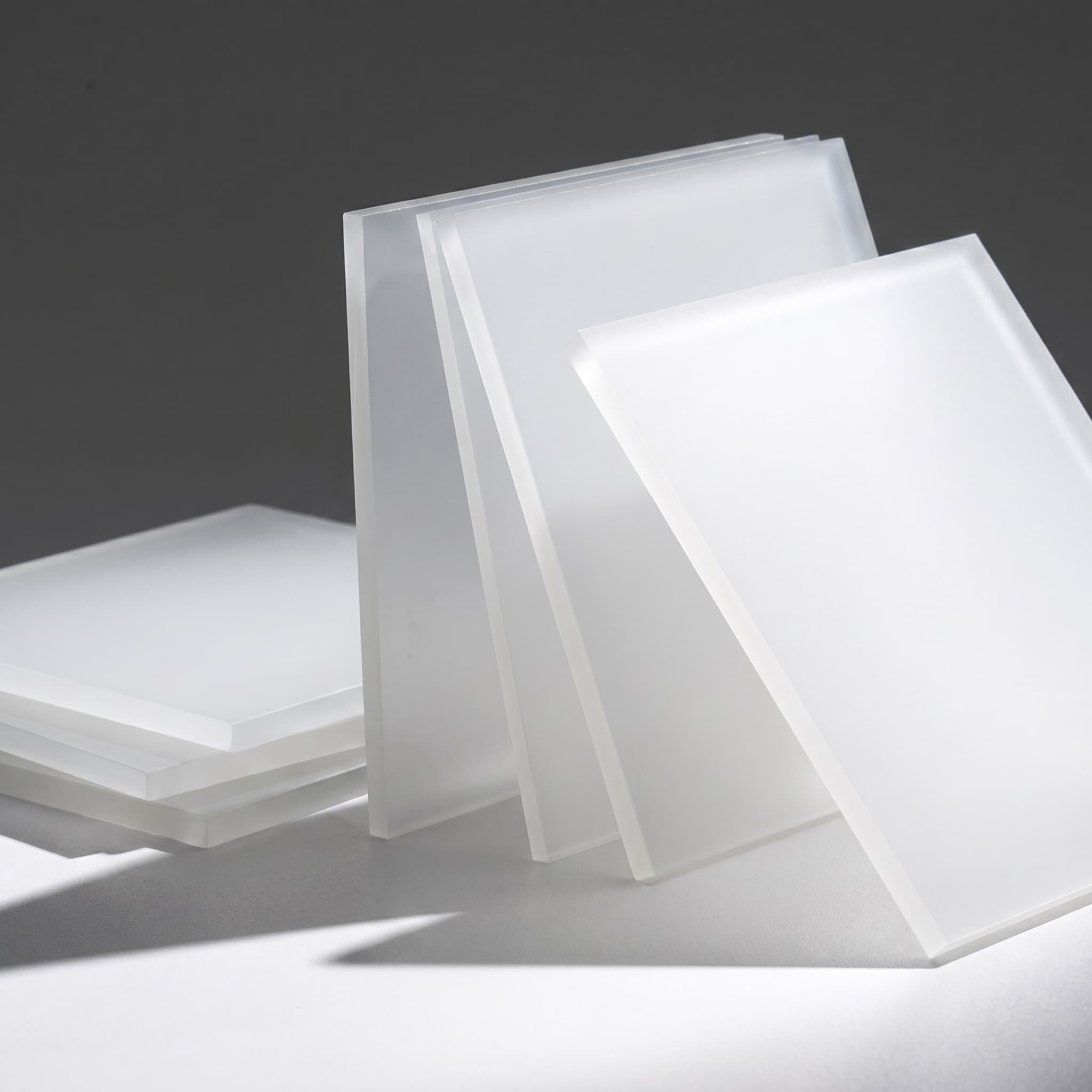
From Grandview Acrylic
Explore one-side and two-side frosted surface options for decorative panels and dividers. The sample photo shows appearance; check privacy in the intended lighting.
Textured Acrylic: Ribbed, Stippled, and Patterned Surfaces
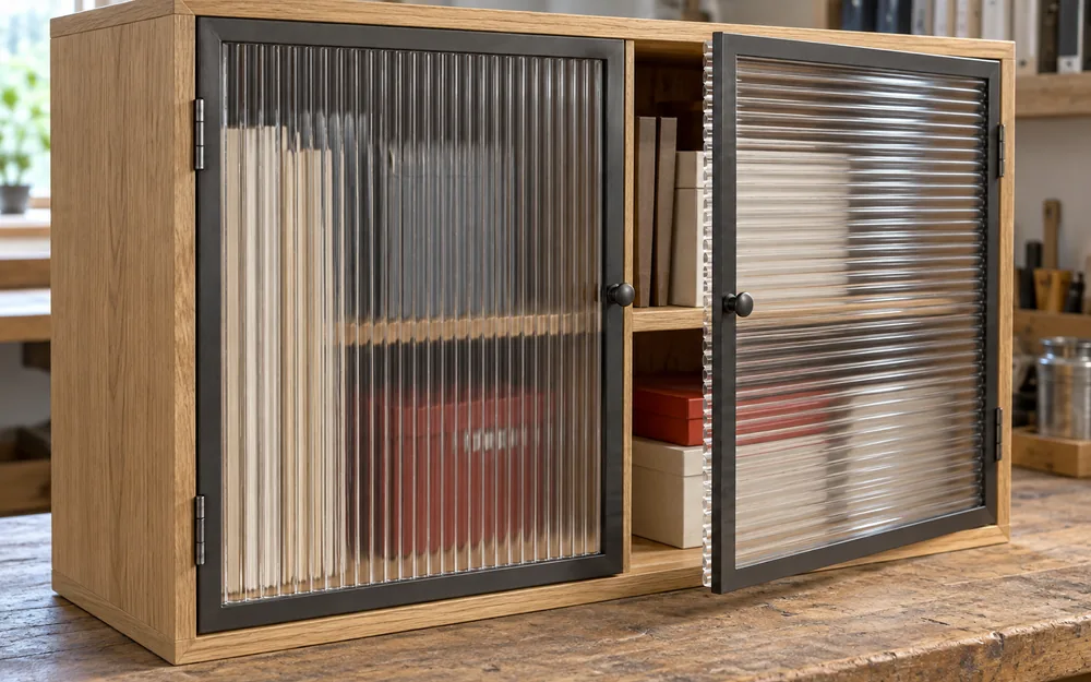
Textured acrylic sheets have surface geometry that contributes to their appearance. Examples include ribs, stippling, and prismatic patterns. A textured face can also look glossy or matte.
Directional patterns deserve attention. Rotate a ribbed panel by 90 degrees and the lines run across the design differently. Adjacent panels may look mismatched if one is rotated. View the sheet upright in its intended position, and distinguish a raised or recessed texture from a printed pattern. Our architectural acrylic panel applications offer context for decorative screens and interior panels.
Non-Glare vs Anti-Reflective Acrylic
Conventional non-glare acrylic uses a fine surface texture to spread reflections. Anti-reflective acrylic, or AR acrylic, uses an optical coating to reduce reflected light. Tru Vue’s glazing FAQ explains this distinction.[3]
A softer reflection does not automatically give a clearer view of fine detail. For a picture frame, compare small lettering and fine lines with the acrylic positioned at the intended distance from the artwork. Follow the selected grade’s instructions for surface orientation and framing depth.
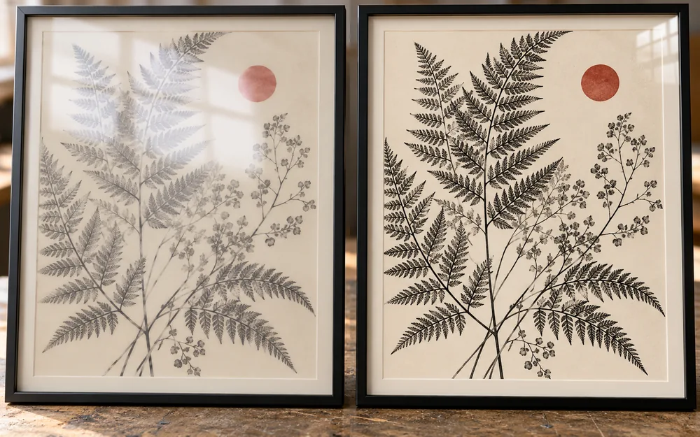
For a display case with objects farther behind its front panel, check through-view clarity before choosing a reflection-control finish. An ordinary frosted divider and a picture-framing cover serve different visual tasks. Our acrylic frames vs traditional glass guide explores the broader framing choice.
Three Questions That Make the Choice Easier
Instead of judging a sheet only as “clear” or “cloudy,” ask three separate questions:
- What is reflected on the surface? Compare the sharpness and distraction of lamps, windows, and surrounding objects.
- What can I see through the sheet? Check readable text, recognizable objects, and the level of privacy.
- How does light look behind it? Check brightness, diffusion, and whether individual light sources remain visible.
A menu cover needs readable text; a divider needs softened visibility; a lighting cover needs an acceptable illuminated appearance. One finish name cannot resolve all three tasks.
Some frosted sheets spread backlighting, but that does not guarantee that they will conceal individual LEDs. Spacing, the light source, and the material all affect the result. See our opal vs frosted acrylic guide for that separate lighting decision.
A Simple Way to Compare Acrylic Finishes
Use samples of the same color and thickness where possible, then make three quick visual checks:
- Reflect a lamp in each surface. Tilt the samples to compare the sharpness and distraction of the reflection.
- Place printed text behind them. Look at large lettering and fine print, then move the text farther behind the sheet.
- Use the intended background. Compare the samples against a white wall, dark backing, or the actual backlit assembly.
These are visual comparisons, not measurements of gloss, haze, light transmission, or scratch resistance.
Frequently Asked Questions
Does matte acrylic scratch less than glossy acrylic?
Not automatically. A low-shine appearance does not establish scratch resistance. Check the exact grade’s stated properties; a finish that makes a mark less noticeable is not necessarily harder to scratch.
Can a frosted acrylic sheet have a glossy side?
Yes. Frosting can be applied to one face or both faces, so the two sides may look different. Check the surface arrangement and view the sheet in the orientation you intend to use.
How should matte, frosted, or non-glare acrylic be cleaned?
Follow the instructions for the exact sheet and any coating. Remove grit gently and use the recommended cleaner with a soft cloth. Avoid abrasive scrubbing; polishing a textured face can alter the finish, so do not polish unless the manufacturer allows it.
Choosing the Right Acrylic Finish
Choose around what people should see: a polished face, softer reflections, reduced visibility, a decorative pattern, or readable graphics. Then check that effect in the lighting, position, and viewing distance where the sheet will be used.
Have a project in mind? Contact Grandview Acrylic with the intended application and a reference for the appearance you want.
Related Reading
- Transparent, Translucent, and Opaque Acrylic Sheets — separate viewing clarity from the surface finish.
- Custom Printed Acrylic Sheets — explore acrylic surfaces used for graphics and displays.
References
- BYK-Gardner — Gloss Measurement. Explains how surface texture changes the distribution of reflected light and the appearance of gloss. View source (PDF).
- ASTM International — ASTM D1003-21. Public scope of the standard test method for haze and luminous transmittance of transparent plastics. Supports treating scattered light and light transmission separately. View source.
- Tru Vue — Frequently Asked Questions. Explains textured non-glare surfaces versus anti-reflective optical coatings. View source.