Tinted acrylic · Color and visibility
Choose the tint for the view it creates.
Compare what remains visible: the brightness of the scene, the color of the objects, and the detail needed for the application.
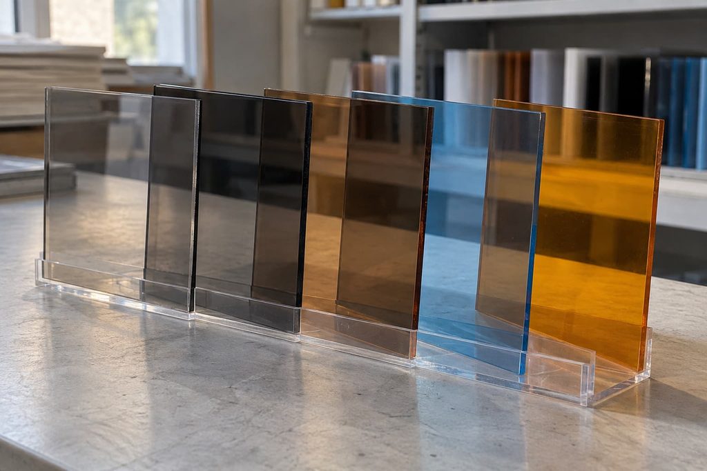
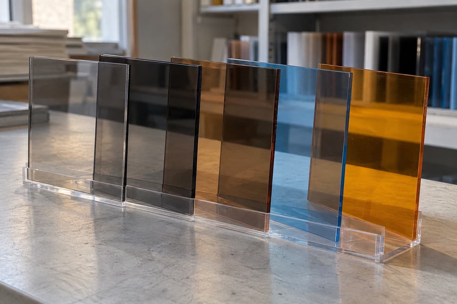
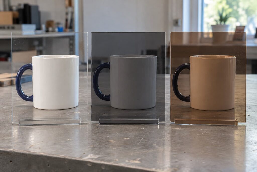
Tinted acrylic sheets add color while preserving a transparent view through the panel. Smoke gray, bronze, and brighter transparent colors change the light reaching the viewer, so objects behind the sheet can look darker or take on a different color cast. These effects make tinted acrylic useful for cabinet doors, display components, interior features, and decorative lighting.
The right choice depends on what people need to see through the finished panel. A tint that looks attractive against a white background might make the contents of a dim cabinet difficult to recognize.
Here, “tinted” means transparent colored acrylic, also called tinted plexiglass. Colored acrylic is a broader category that includes translucent and opaque sheets. Our transparent, translucent, and opaque acrylic guide explains those categories in more detail.
Smoke Gray, Bronze, and Transparent Colors
Colorants change the sheet’s transmission of visible light. The resulting appearance involves both light passing through the material and light reflected from its surface. This is why the same sample can look different against a dark cabinet, a white wall, or an illuminated background. ACRYLITE’s color and light-transmission guidance recommends evaluating color under the intended conditions of use.[1]
Smoke gray is a starting point for darker cabinet panels and display covers. Bronze or brown introduces a warmer tone that can suit furniture inserts and interior accents. Transparent red, blue, green, and amber create more pronounced color effects for decorative panels and lighting features.
These names describe color families, rather than fixed optical specifications:
| Tint family | Common uses | What to judge in the finished setting |
|---|---|---|
| Smoke gray | Cabinet doors, display covers, interior panels | Whether objects remain bright enough to recognize |
| Bronze or brown | Furniture inserts, decorative screens, warm-toned interiors | Whether the warmer view suits the background and objects |
| Transparent bright colors | Exhibition elements, branded installations, lighting accents | Whether changes to object or light color are acceptable |
Scroll sideways to compare all columns.
For a decorative screen, a strong color cast may be the intended effect. For a cosmetics display, it could interfere with how customers judge the products. Compare the material with the objects it will actually surround or cover.
What Light Transmission Tells You
Visible light transmission describes the proportion of visible light passing through a sample under specified measurement conditions. A lower value means less transmitted light under those conditions; it does not, by itself, tell you how clearly an object’s outline will remain visible.
For example, the ACRYLITE Color Number Chart lists these two premium FF gray grades as transparent. Both belong to the same color family, yet their stated transmission differs substantially.[2]
| ACRYLITE premium FF | Gray 7C025 | Gray 7C026 |
|---|---|---|
| Light transmission Chart basis: TD65 | 25% | 13% |
| Optical category | Transparent | Transparent |
| Across thicknesses | Marked constant | Marked constant |
Source: ACRYLITE Color Number Chart, premium FF colors, page 1.[2] Manufacturer-specific examples; not Grandview product values or universal specifications for gray acrylic.
To understand the view, also consider haze: the scattering of transmitted light that gives a material a cloudy appearance and reduces the distinctness of objects behind it. ASTM D1003 measures luminous transmittance and haze separately. A dark transparent tint and a light-colored diffuser can therefore serve very different purposes.[3]
This distinction matters for lighting. A transparent colored panel filters the light’s appearance, but it does not automatically spread that light enough to hide individual LEDs. For an evenly glowing lightbox, evaluate a suitable diffuser and the lighting arrangement. Our opal vs frosted acrylic guide covers that separate choice.
Does a Thicker Tinted Sheet Always Look Darker?
Thickness can affect transmission because light travels through more material. However, some product grades are supplied with a constant transmission specification across thicknesses.
The ACRYLITE chart identifies whether each grade has this characteristic. The two gray examples above are marked as constant-transmission grades. Their published values should therefore be read with that condition, rather than assuming every thicker version must transmit less light.[2]
When comparing samples, check whether the quoted transmission applies to one thickness or across the grade’s thickness range. Select thickness for the panel’s size, support, and fabrication needs, then evaluate the appearance of that specific material.
Matching Tinted Acrylic to the Application
Cabinet doors and display covers: The contents need enough illumination to remain visible through the selected tint. Consider a smoke-gray cabinet door: with the interior lights on, its contents may be easy to identify; with those lights off, the same door can appear much darker. Evaluate both conditions if both occur during normal use.
Furniture and interior features: Transparent color can introduce a visual layer while retaining a view beyond the panel. The surrounding background contributes to the result, so review the sample upright and in its intended location. A small sample on a desk does not reproduce the view through a full-height decorative screen.
Lighting and exhibition elements: Transparent colors can create colored light and visible overlaps between panels. Decide whether the project needs that effect or a uniformly illuminated surface. Those tasks require different material and lighting choices.

A dark tint also does not establish reliable privacy. Objects or people behind it can remain recognizable when the rear space is sufficiently illuminated. If obscuring detail is the main requirement, compare clear and frosted acrylic under the intended viewing conditions.
Approving the Material and the Finished Part
Approve a tinted sample with its surroundings in place. The most useful comparison keeps the light source, background, object, and viewing distance consistent while changing the material.
- Use the intended object and lighting. Check readable labels, recognizable details, and any product colors that matter.
- Compare the actual grade and thickness. Record the supplier’s color code so a descriptive name does not become the only approval reference.
- Include visible fabrication details. If the design has polished edges, bends, printing, or bonded joints, assess a representative processed sample.
- Keep an approved reference. Record the viewing conditions alongside it, giving later batches a meaningful comparison basis.
Tint leaves visible details behind the sheet in view, including parts of an assembly that an opaque panel might conceal. This makes edge finish, joints, and internal hardware relevant to appearance. For assembled components, include those areas in the review; our custom acrylic bonding and splicing service provides a related project entry point.
Conclusion
Choose tinted acrylic for the view it creates: the brightness, color, and detail that remain visible in the finished setting. A color name gives you a starting point; the specific grade and its surroundings determine whether the result fits the project.
References and Further Reading
-
Light transmission for white and colored ACRYLITE acrylic sheet
Source: ACRYLITE / POLYVANTIS. Supports the relationship between color, transmitted and reflected light, and intended viewing conditions.
View Source -
ACRYLITE Color Number Chart
Source: ACRYLITE / POLYVANTIS. Premium FF colors, page 1. Supports the specific gray-grade transmission values, transparent classifications, and constant-transmission indicators.
View Source -
ASTM D1003: Haze and Luminous Transmittance of Transparent Plastics
Source: ASTM International. Supports treating luminous transmittance and haze as separate optical measurements.
View Source